Design System
Typography:
The following are examples of SPEC’s typographical styles. SPEC uses the font family LATO and uses font size to distinguish between heading styles. All headings and text are in the colour #001A15
Lato Aa
Heading 1
For use ONLY as the page title. Heading 1 is important for SEO, so it should only be used once and it should include keywords that match the page title and URL.
Heading 2
Heading 2s can be used multiple times on a page and should be used to distinguish sections. As the second largest headings on a page, these headings will primarily allow the reader to skim through page content.
Heading 3
Heading 3s are used primarily for the introductory sentence of a paragraph that you want to stand out. You can see this used on program pages.
Heading 4
Heading 4s are used when accent headings are needed, such as for lists, grids, and icon titles.
Heading 5
Heading 5 has not been used so far, as it is smaller than body text. But this could be used in cases where an image caption or link requires bold text, but is less important than body text.
Body
Body text is used for all regular paragraph text. Body text is used from the “text” widget, rather than the “heading” widget.
Colours
SPEC’s brand colours are used throughout the site.
Brand Green
#006F5B
SPEC’s brand green is the primary colour used throughout the site. It is used to indicate interactions or to draw the user’s eye. This includes buttons, icons, SPEC’s logo, and the footer.
Text
#001A15
This is the colour that is used for all text, including headings. The only exception are buttons, hyperlinks, and the occasional heading if absolutely necessary.
Accent 1
#A6CE39
This is a bold accent colour that should be used sparingly. Use it to draw a lot of attention (social icons) or for hover states for hyperlinks and buttons.
Accent 2
#A6CE39
This is a secondary accent colour that can be used more frequently, when necessary. For example, accordions and drop-down menus can utilize this colour.
Grey Background
#708E8817
This is the grey background used behind alternating sections to help the user chunk relevant content. It is created from the colour #708E88 with opacity level 17.
Light Grey
#B7B7B7
This is a light grey that can be used in various scenarios that call for a neutral grey, such as divider lines, boxes, light text, or other minor decorations.
Iconography:
There is no set of icons defined for SPEC to use. Feel free to use any from Elementor’s icon library that use thick lines or are filled in. Icons are generally coloured with the Brand Green.
Logo:
SPEC’s website should primarily use the logo without taglines.
Buttons:
SPEC has three levels of buttons. The dark green buttons are the most attention grabbing, and should be used for primary calls to action. The second, outlined button should be used for secondary calls to action. The final button link should be used for less important links.
Grids, Sections & Layouts
Grids:
SPEC’s website uses a 4 px grid system, meaning all spacing between elements are multiples of 4. In the following sections, you will notice all pixel values are multiples of 4.
Sections:
Content on SPEC’s webpage should be divided into sections. These are the areas with the blue box surrounding them. See the example image below:

Spacing
Note: Default means the box is empty. When the box is empty for desktop, it defaults to the system’s default value. When the box is empty for tablet and mobile, it defaults to the value set at the larger viewport. For example, if desktop is set to 16, 16, 16, 16 px, and tablet has no values, it will default to 16, 16, 16, 16 px.
Margins
Desktop: 0, 0, 0, 0 px
Tablet: Default, Default, Default, Default
Mobile: Default, Default, Default, Default
Padding
Desktop: 40, 16, 40, 16 px
Tablet: Default, Default, Default, Default
Mobile: Default, Default, Default, Default
Columns:
Columns are the blocks within sections that contain all content (text, headings, images, icons, etc).
Default Single Column Spacing
Margins
Desktop: Default, Default, Default, Default
Tablet: Default, Default, Default, Default
Mobile: Default, Default, Default, Default
Padding
Desktop: 0, 0, 0, 0 px
Tablet: Default, Default, Default, Default
Mobile: Default, Default, Default, Default
Double Column Spacing
Margins
Desktop: Default, Default, Default, Default
Tablet: Default, Default, Default, Default
Mobile: Default, Default, Default, Default
Padding
Desktop:
Left Column: 0, 24, 0, 0 px
Right Column: 0, 0, 0, 0 px
Tablet: Default, Default, Default, Default
Mobile: Default, Default, Default, Default
Section Layout
Height: Default
Vertical Align: Centered
Example Section - 1 Column
Lorem ipsum dolor sit amet, consectetur adipiscing elit. Ut elit tellus, luctus nec ullamcorper mattis, pulvinar dapibus leo. Lorem ipsum dolor sit amet, consectetur adipiscing elit. Ut elit tellus, luctus nec ullamcorper mattis, pulvinar dapibus leo.
Example Section - 2 Columns
Lorem ipsum dolor sit amet, consectetur adipiscing elit. Ut elit tellus, luctus nec ullamcorper mattis, pulvinar dapibus leo. Lorem ipsum dolor sit amet, consectetur adipiscing elit. Ut elit tellus, luctus nec ullamcorper mattis, pulvinar dapibus leo.

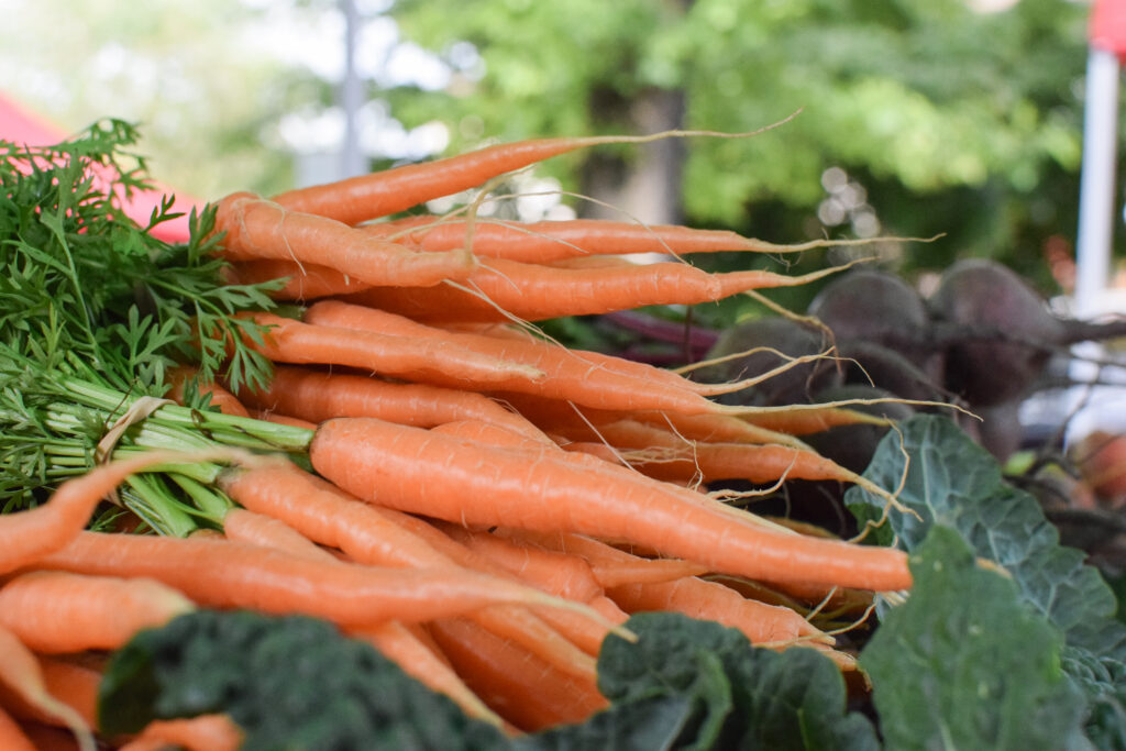
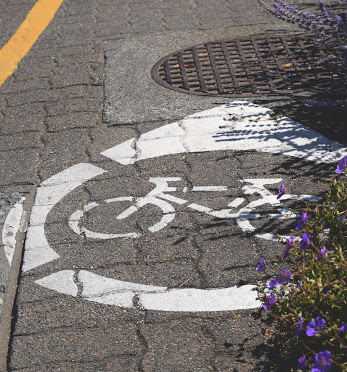
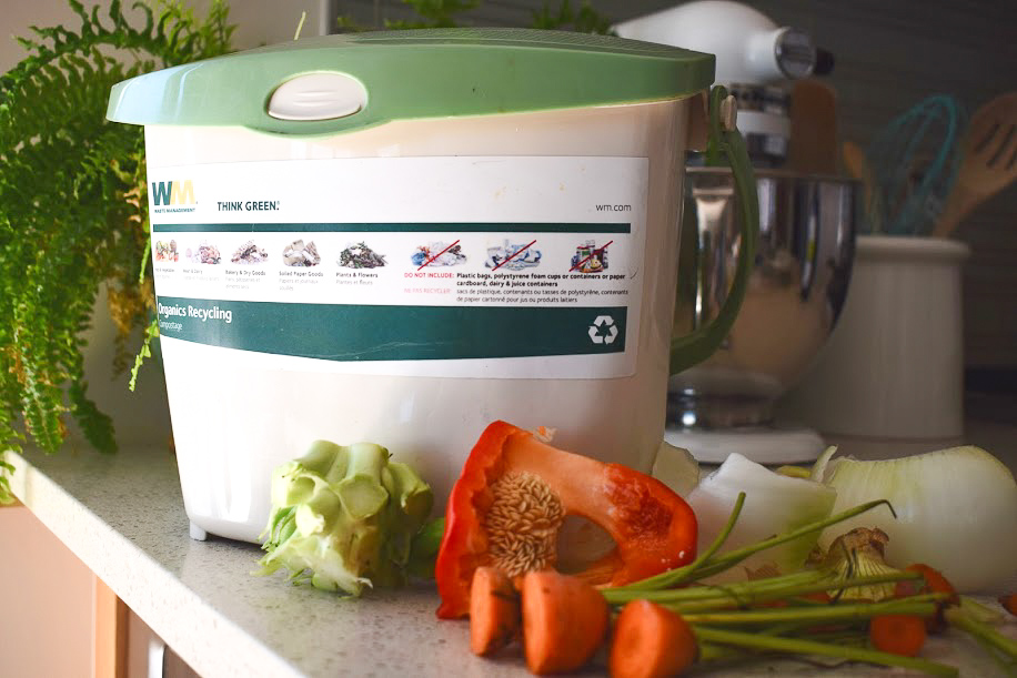
Cards: Team Projects
Cards are groupings of elements on a page that signify relevant information and interactions. SPEC’s website uses cards assorted in a grid as a menu on our homepage and on our Team pages. Below is the description for the cards used on SPEC’s Team pages.
Team Project Cards
Column Spacing
Columns
Desktop: 3 columns
Tablet: 3 columns
Mobile: 1 column stacked
Margins
Desktop: 0, 24, 0, 0 px
Tablet: 0, 16, 0, 0 px
Mobile: 0, 0, 16, 0 px
Padding
Desktop: Default
Tablet: Default
Mobile: Default
Styling
Columns
Layout:
Default
Style:
Border Radius: 8, 8, 8, 8 px
Advanced:
See “Spacing” above
Image
Content:
Large Size Image
Style:
Width: 100%
Max Width: 100%
Height: 240 px
Fit: Cover
Border Radius: 8, 8, 0, 0 px
Advanced:
Margin: -15, -15, 0, -15 px
Padding: 0, 0, 0, 0 px
Section Background
Colour:
Grey Background
#708E8817
Button
Style:
Secondary Button
Text
Heading:
Heading 4
Body:
Regular Text
Cards: Focus Areas
Cards are groupings of elements on a page that signify relevant information and interactions. Below are the cards used on SPEC’s homepage. These are nearly identical to the cards used for Team projects, except they do not have buttons, have green, hyperlinked Heading 3s, and a very slight box shadow. These differences are highlighted in yellow.
Team Project Cards
Column Spacing
Columns
Desktop: 3 columns
Tablet: 3 columns
Mobile: 1 column stacked
Margins
Desktop: 0, 24, 0, 0 px
Tablet: 0, 8, 0, 0 px
Mobile: 0, 0, 16, 0 px
Padding
Desktop: Default
Tablet: Default
Mobile: Default
Styling
Columns
Layout:
Default
Style:
Border Radius: 8, 8, 8, 8 px
Box Shadow: Blur 20, rgba (0, 0, 0, 0.06)
Advanced:
See “Spacing” above
Image
Content:
Large Size Image
Style:
Width: 100%
Max Width: 100%
Height: 240 px
Fit: Cover
Border Radius: 8, 8, 0, 0 px
Advanced:
Margin: -15, -15, 0, -15 px
Padding: 0, 0, 0, 0 px
Section Background
Colour:
Grey Background
#708E8817
OR
White Background
#FFFFFF
Text
Heading:
Heading 3, Green
Body:
Regular Text
Heros (Page Headings):
All pages begin with a heading section that utilizes a background heading. To set the background image, edit the section, under the style editing panel, you can select an image.
IMPORTANT: For headings, the padding is determined by REM not pixels (px), which means that the padding will adjust proportionally to the viewport size.
Spacing
Margins
Desktop: Default, Default, Default, Default
Tablet: Default, Default, Default, Default
Mobile: Default, Default, Default, Default
Padding
Desktop: 8, 1, 8, 1 REM
Tablet: 6, 1, 6, 1 REM
Mobile: Default, Default, Default, Default
Styling
Style
Overlay Type: Classic
Colour: #001A15;
Opacity: 0.4
Image Settings:
Position: Center Center
Attachment: Scroll
Size: Cover
Mobile: Default, Default, Default, Default